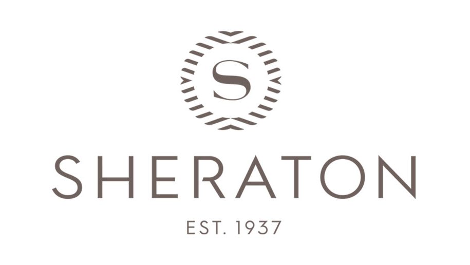
Marriott has unveiled a new logo for Sheraton, as the brand continues its transformation programme in the US and beyond.
The group said that the new logo “pays homage to its past and depicts its vision for the future”.
Gone is the iconic laurel design, reimagined “as movement from the world and the energy of gathering, which point to the modernized Sheraton ‘S’ redrawn at the centre”.
Marriott has previously said that inspiration for the repositioning of the Sheraton brand “came from modern day town squares in Europe such as the Piazza del Campo in Siena, Trafalgar Square in London, and Plaza Mayor in Madrid, which function as places at the heart of the community where people gather and the city comes to life”.
The renovated Sheraton Grand Phoenix will be the first hotel to take on the new brand identity later this year, and will serve as “a living and breathing lab, showcasing design and activations, using new technology and insights that bring a unique community vibe to the space”.
Guests will start to see the new logo on collateral and websites from April.
Commenting on the redesign, Mara Hannula, Vice President, Global Brand Marketing, Classic Premium Brands, said:
“The logo’s evolution reflects the renewed energy and firm commitment we are making to our owners and guests to the resurgence of this iconic brand.
“More than a logo, this is a symbolic statement of Sheraton’s vision for our new guest experience. This was the final piece of the redesign puzzle.
“This new logo offers a modernized look and feel to match the reimagined space while maintaining the powerful equity and recognition of the original logo.”


